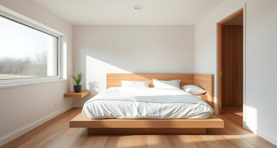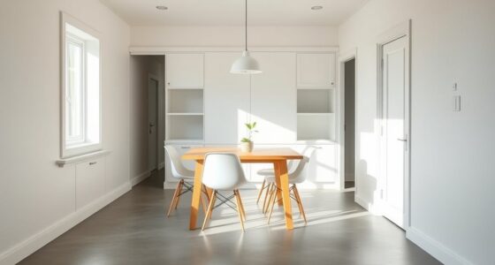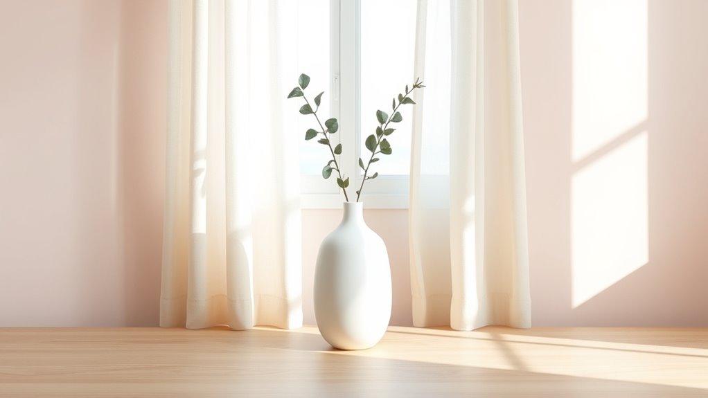

To create a calming minimalist space, choose color schemes with gentle beiges, cool grays, and soothing pastels. Opt for soft, neutral hues that promote tranquility and focus, avoiding bright or contrasting colors that can overstimulate. Balancing cool tones like blues and greens with warm neutrals helps evoke serenity and mental clarity. A thoughtful palette reinforces simplicity and peace, making your environment a true retreat. Keep exploring to discover more tips for inspiring calm through color choices.
Key Takeaways
- Choose soft, neutral tones like beige, light gray, and taupe to create a tranquil environment.
- Incorporate calming pastel shades such as muted blues and gentle greens for serenity.
- Limit color palettes to harmonious shades to promote visual harmony and reduce overstimulation.
- Use cool hues alongside warm neutrals to balance energy and foster relaxation.
- Avoid bright or contrasting colors to maintain a peaceful, clutter-free atmosphere.

Have you ever noticed how simple color schemes can create a more calming and focused environment? It’s no accident—your choice of colors can notably influence your mood and mental clarity. When it comes to minimalist color themes, the key lies in thoughtful color palette selection. By choosing hues that are muted, neutral, or soft, you craft a space that promotes tranquility and reduces visual noise. These palettes often include shades like gentle beiges, cool grays, or soothing pastels, which work together to foster a sense of order and calm. Avoiding overly bright or contrasting colors helps prevent overstimulation, allowing your mind to relax and focus more easily. Embracing visual harmony in your color choices further enhances the peaceful atmosphere you seek. Your selection of colors isn’t just about aesthetics; it’s about the emotional impact they have on you. Each hue can evoke specific feelings—blues and greens tend to promote serenity, while whites and light taupes create a sense of spaciousness and purity. When you opt for a minimalist approach, you’re intentionally curating an environment that nurtures emotional well-being. The subtlety of the color palette helps to eliminate distractions, guiding your attention inward or toward the task at hand. This intentional choice of calm-inducing colors can make your space feel more open, less cluttered, and ultimately more inviting for relaxation or concentration. In choosing your color palette, think about the kind of emotional response you want to cultivate. If you want a peaceful retreat, lean toward cool, muted tones that evoke a sense of stillness. For a more energizing yet calm atmosphere, consider incorporating warm neutrals with hints of soft pastel accents. The goal is to strike a balance that resonates with your personal sense of tranquility. Minimalist color themes don’t require complex combinations; they thrive on simplicity and restraint. By limiting your color choices to a few harmonious shades, you reinforce a sense of order and clarity, which in turn enhances your emotional stability. Ultimately, the power of minimalist color themes lies in their ability to influence your emotional landscape through careful color palette selection. When you choose colors thoughtfully, you create an environment that fosters calmness and focus, helping you feel more centered and less overwhelmed. This approach isn’t just about style—it’s about designing a space that supports your mental and emotional health. So, the next time you plan your space, remember how impactful your color choices can be. Keep it simple, intentional, and soothing, and you’ll find that your environment naturally encourages a peaceful, focused state of mind.

Modern Ceramic Vase Set, Neutral Colors, Decorative Vases for Home Shelf Decor, 4 Piece Collection, Happy Birthday Gifts for Women Mom Her Friend Sister Wife Grandma, Self Care Gift (Coffee Mix set 4)
VERSATILE SET: Collection includes 4 uniquely shaped ceramic vases in complementary neutral tones – Terracotta, Cacao brown, and…
As an affiliate, we earn on qualifying purchases.
As an affiliate, we earn on qualifying purchases.
Frequently Asked Questions
How Do I Choose the Right Minimalist Color Palette for My Space?
To choose the right minimalist color palette for your space, focus on color harmony by selecting shades that complement each other seamlessly. Start with neutral tones like whites, beiges, or soft grays for a calming foundation. When it comes to paint selection, opt for high-quality, low-VOC finishes to guarantee a serene environment. Test swatches in different lighting to see how colors interact and create the peaceful vibe you desire.
Can Minimalist Color Themes Be Customized for Different Moods?
Your minimalist color theme can totally be customized for different moods—it’s like a secret superpower! By understanding color psychology, you can adapt your space’s hues to boost relaxation, focus, or energy. For example, soft blues calm you, while vibrant yellows energize. With thoughtful mood adaptation, you create a versatile environment that reflects your changing needs, making your space not just minimal but perfectly tuned to your emotional vibe.
What Are Common Mistakes to Avoid With Minimalist Color Schemes?
You should avoid color clash by sticking to a cohesive palette and not overusing neutrals, which can make your space look dull. Don’t overdo it with too many shades or textures; simplicity is key. Also, steer clear of cluttered designs that distract from the calm vibe. Keep your color scheme balanced, and focus on subtle contrasts to create a serene, inviting environment.
How Do Minimalist Colors Impact Mental Well-Being?
Imagine walking into a room painted in soft, neutral tones that instantly soothe your mind. Minimalist colors, guided by color psychology, promote emotional balance by reducing visual clutter and calming your nerves. They help you feel more centered and focused, encouraging mental clarity. By choosing gentle hues, you create a space that fosters relaxation, ultimately supporting your mental well-being and helping you handle stress more effectively.
Are There Specific Brands or Products That Offer Minimalist Color Themes?
You can find minimalist color themes through brands like Muji, IKEA, and West Elm that focus on neutral palettes inspired by color psychology. Many of these brands collaborate with designers to create calming, cohesive spaces. Keep an eye out for their collections or brand collaborations, which often emphasize simple, muted tones that promote tranquility and mental well-being, making it easier to incorporate minimalist color themes into your environment.

Viva Decor Chalk Paint for Furniture – Set of 5 (Pastel: White, Pink, Blue, Green, Grey, 5×3,38 fl oz) Painting DIY, Cabinets, Glass, Multi-Surface Craft Paint, Non-Toxic, All-in-One, Made in Germany
CHALK PAINT – creamy water-based chalk paint for interior and exterior use. The paint is highly pigmented, has…
As an affiliate, we earn on qualifying purchases.
As an affiliate, we earn on qualifying purchases.
Conclusion
As you explore these minimalist color themes, you might find yourself unexpectedly calmer, almost as if the perfect shade was waiting for you all along. Sometimes, it’s the simplest choices—like a soothing hue—that create the biggest impact. You might not realize it now, but choosing calm colors could subtly transform your daily mood. After all, isn’t it curious how a single shade can turn your space—and your day—around without you even noticing?

Braveriky Decorative Books for Neutral Home – Fake Books Storage Box for Decoration – Set of 2 Coffee Table Book – Photo Storage Keepsake Box for Room Bookshelf Decor, Charcoal
Elevate Your Space with Neutral Home Design: Create a serene foundation with this decorative book set. Each book…
As an affiliate, we earn on qualifying purchases.
As an affiliate, we earn on qualifying purchases.

Rustic Wood Relax Sign Decorative Cutout Word Sign Wall Decor, Multicolor Wooden Relax Word Sign Freestanding Block Letters Wall Mounted Decorative Sign (Multicolor Relax Sign)
VERSATILE RELAX WOODEN SIGN: Relax block sign adds a nice touch to your living room decor, dining room…
As an affiliate, we earn on qualifying purchases.
As an affiliate, we earn on qualifying purchases.